The Clovelly Hotel - Rebrand & Collateral
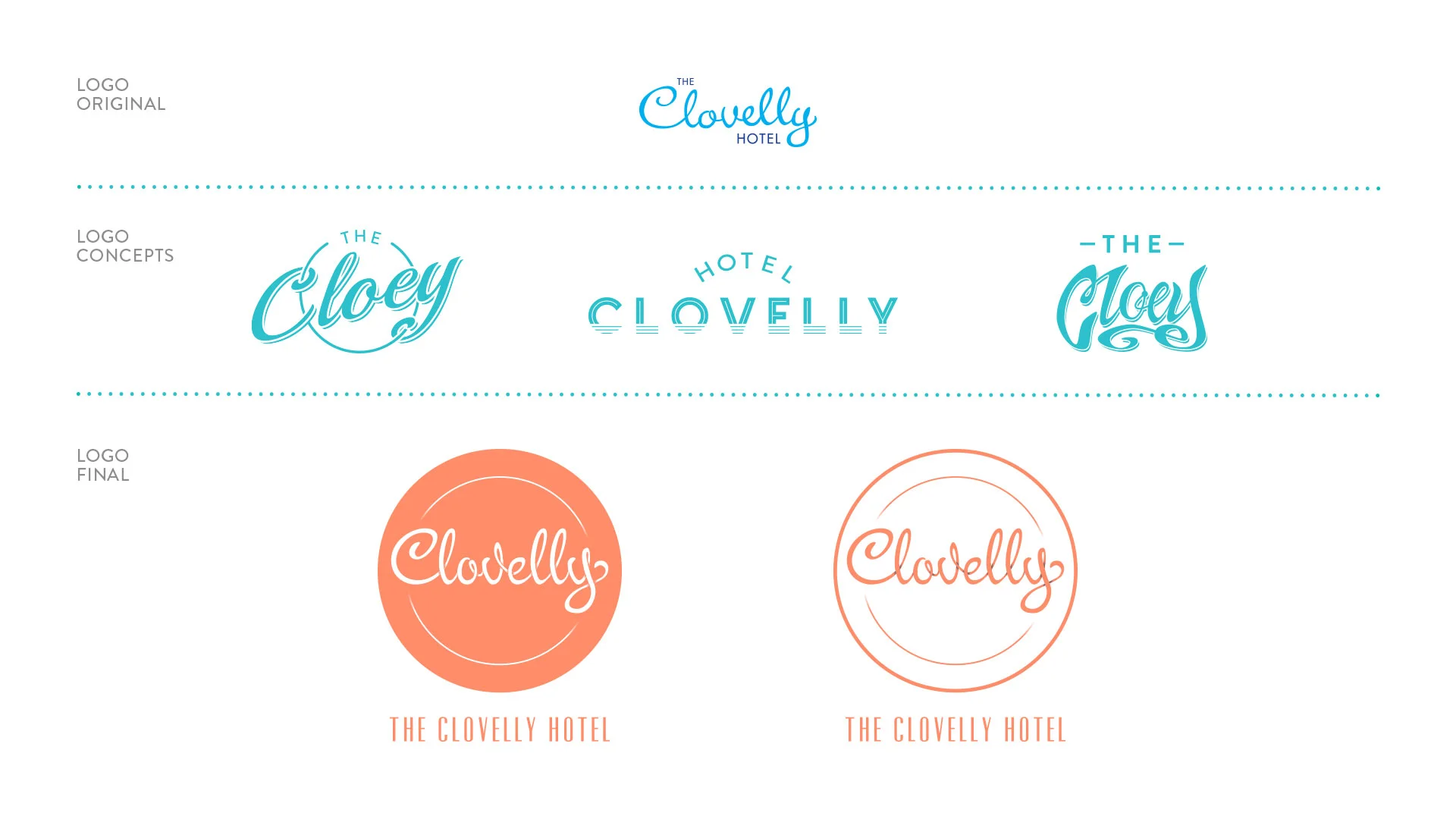
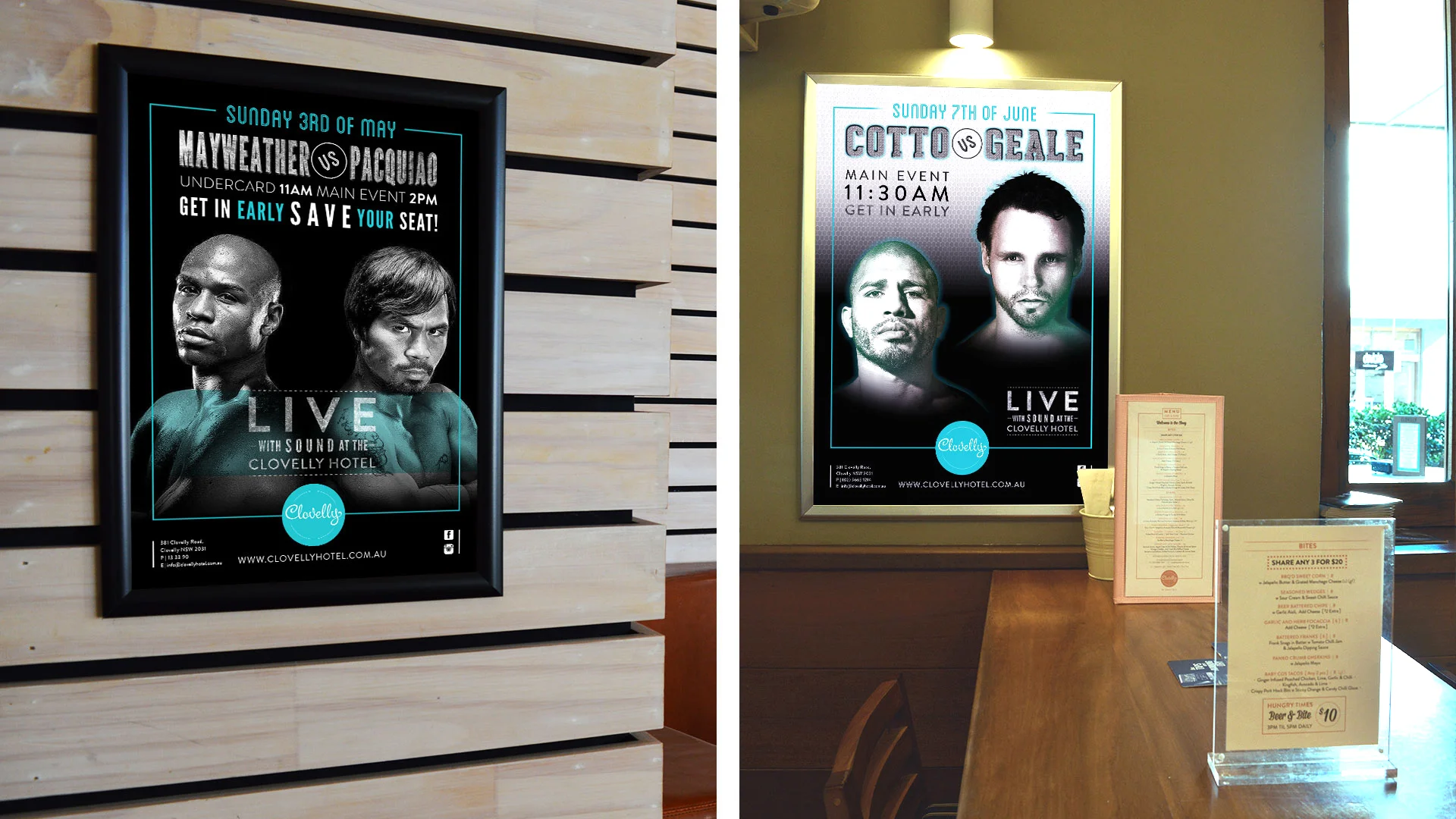
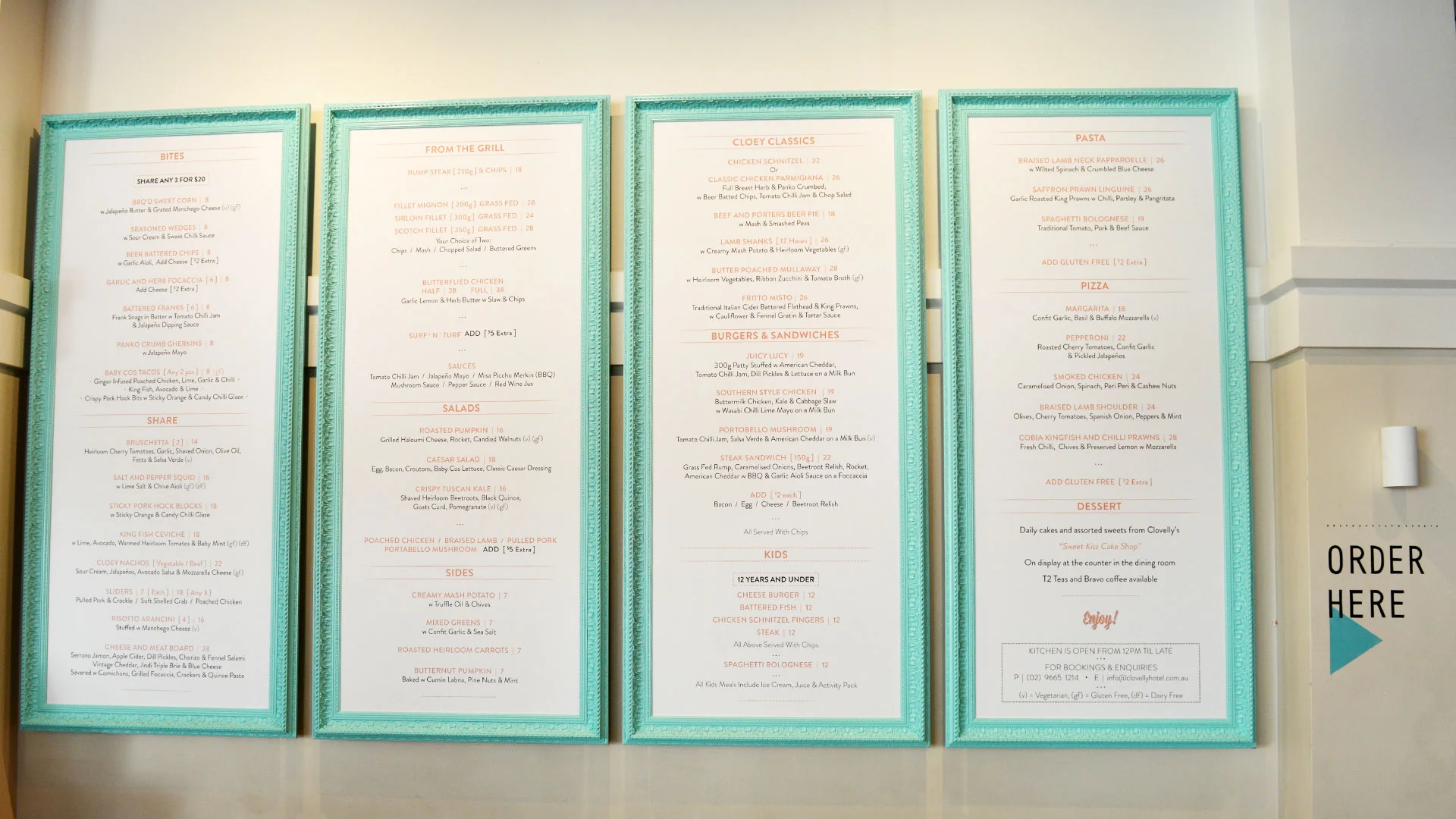
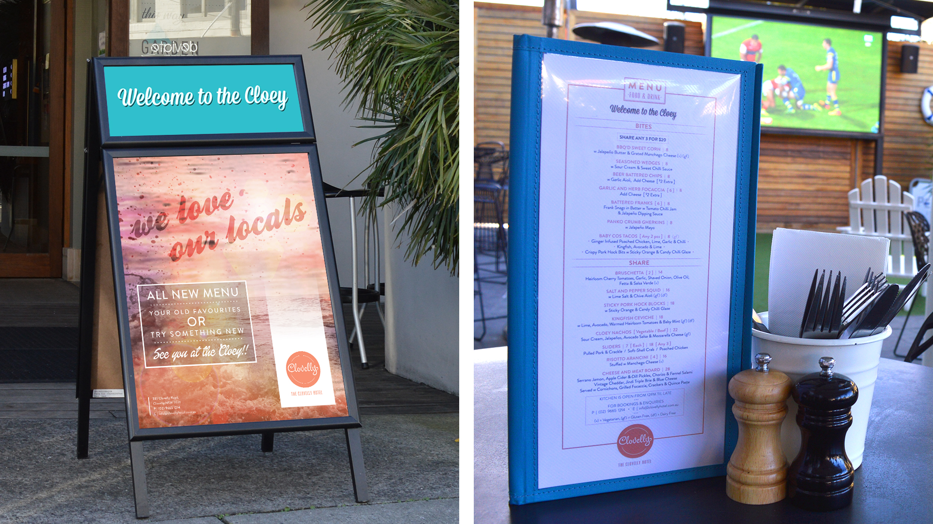
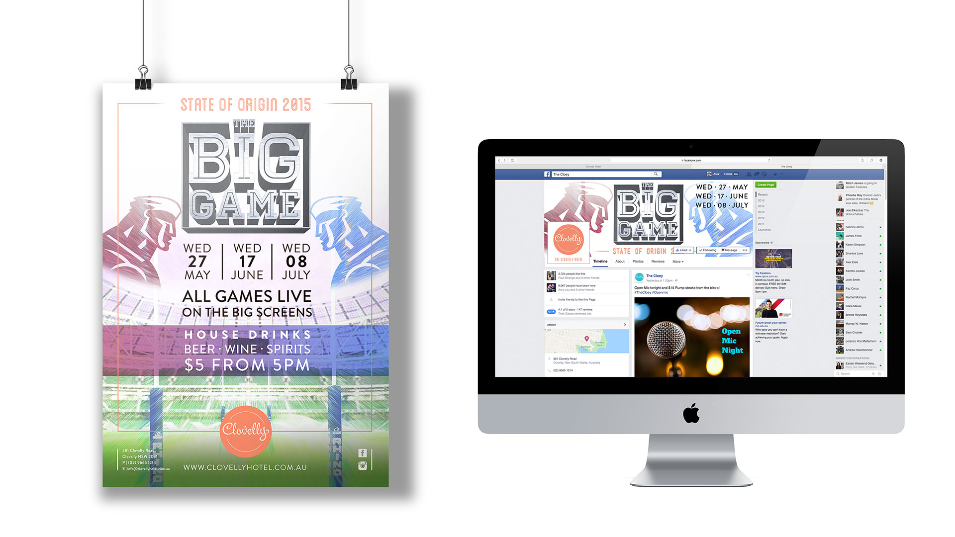
Having worked in hospitality for many years myself, it’s always been a dream of mine to rebrand a bar. I understand the needs of the business on an intricate level, which assisted me in my direction of the rebrand. Starting with researching and analysing the brand, I conducted a brand audit and prepared mood boards for signage, typography, venue artwork, theme and decore, imagery, logos and photography. We ended up deciding with a touched up version of the original logo to maintain recognition. I then expanded the design elements from the logo into collateral for a number of events as well as the food, wine and cocktail menus, table talkers, rooftop banner etc.
The Clovelly Hotel prides itself as a destination venue and landmark in the affluent suburb of Clovelly. Accessible to all, the venue is family friendly while still appealing to Locals, Sydney Siders and Travellers, accomodating all age groups and demographics. The Venue has a beachy yet mature and modern feel and trades a modern menu of food and drinks.
The new Clovelly Hotel logo has been created to bring a fresh new look to the venue while still maintaining similar characteristics of its predecessor. The “Clovelly” logotype is similar, however its been redesigned to be more elegant introducing an element of depth by the use of shading behind the letters as it loops from one letter to the next. This flowing cursive type is representative of the wind and the waves that grace the Clovelly coastline, and reflects the following characteristics: Personal, Community, Mature, Elegant, Feminine, Modern and Beachy.
The complete logo lockup shown below shows the logo stamp accompanied by the words “The Clovelly Hotel” in Vevey font, an elegant, modern and condensed typeface which contrasts the fluidity of the “Clovelly” logotype.

